Constraint
Data Existed, But Was Scattered
Design Response
Reorganised and prioritised it around key payment tasks.
Helping businesses to send cross-border payments with confidence.
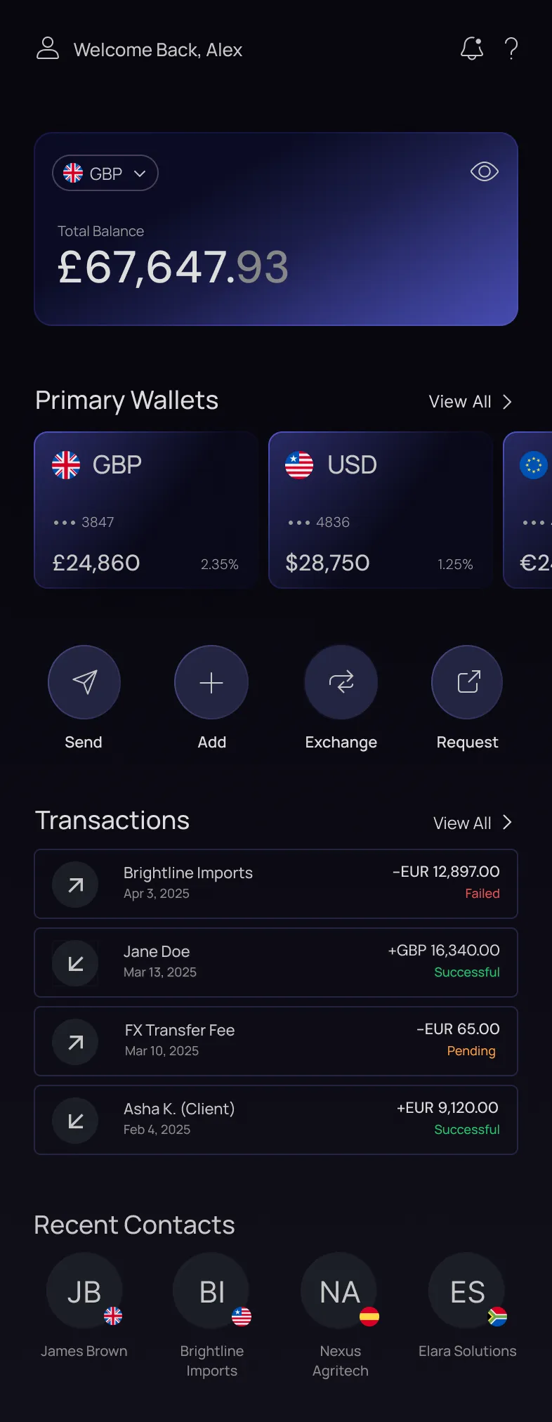
Finance teams need to act quickly across multiple currencies, without losing sight of the numbers that matter.
The dashboard reduces noise by bringing balances, wallet performance and priority actions into a clear hierarchy. Digestible cards and streamlined calls to action help teams make confident decisions without searching across the platform.
The platform’s core functionality was in place, but the experience around it was fragmented. Key tasks were slow, unclear and harder to complete than they needed to be for teams managing high-value cross-border payments.
Platform usability was slowing sales conversations and client onboarding.
Technical constraints and legacy architecture shaped what could change safely.
Recurring questions revealed confusion around transparency, subscriptions and payment failures.
Wallet balances, FX rates and transaction status were either hidden or below things nobody opened.
Sending a payment, approving one or retrying a failed one each took more clicks than the task deserved.
Nothing said what mattered, what needed attention, or what to do next. You had to already know.
“The data already exists. It’s just scattered.”
Financial controllers at SMEs, or small and medium-sized businesses, manage multi-currency transactions and cash flow, ensuring payments go through smoothly. Understanding their priorities revealed where the journey created friction, hid critical information or slowed the next action.
Check wallet balances between meetings, often on a phone.
Watch the rate before committing to a conversion.
Chase the payment that failed or is still sitting pending.
Real-time visibility of balances & current rates
Payment history reachable without hunting for it.
Efficient payment workflows
Fewer failures they only find out about afterwards.
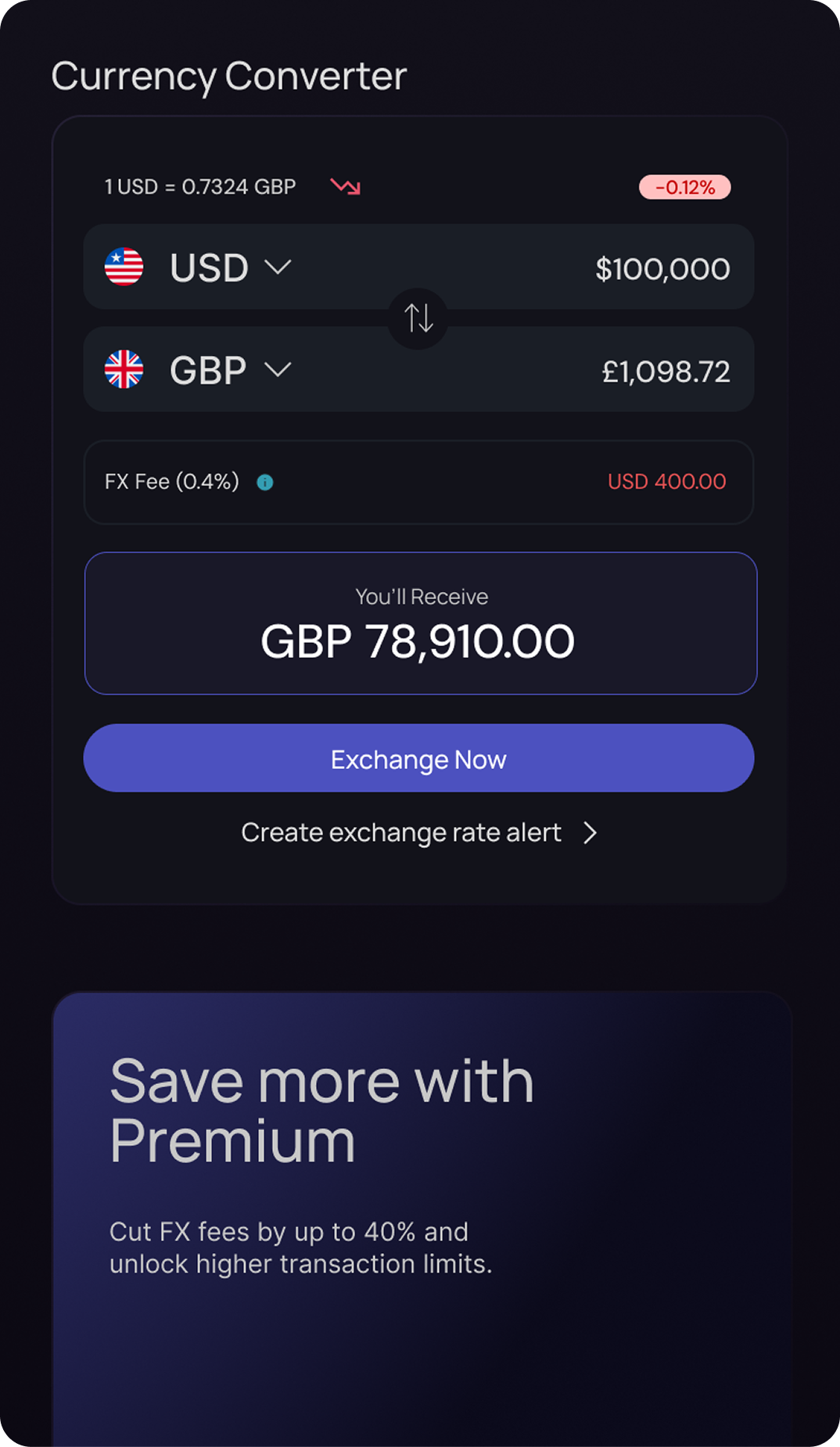
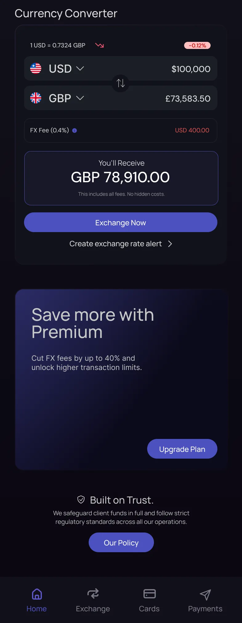
Currency conversion is a high-stakes task for global businesses.
The pattern already in the product surfaced cost afterwards: pick an
amount, confirm, and the fee and the applied rate turn up on the
receipt. At the moment of decision that looks like the better deal,
which is exactly the problem - the difference lands later, on
transfers where they’re dealing with real money.
By showing the FX rate, fee, and final amount upfront, we reduce uncertainty
and build trust before the user commits. It’s a transparency-first approach
that reduces drop-off and increases confidence in conversions where large
sums matter.
Leadership needed fast wins for sales and support, so I prioritised changes that improved clarity and conversion without waiting for a full platform rebuild.
Engineering confirmed the data already existed, but was scattered. Working closely with them, we used a phased UI approach to surface key payment insights in fewer clicks while staying within the existing system constraints.
As the UX/UI designer, I translated stakeholder needs and technical constraints into reusable interface patterns engineering could deliver incrementally.
Reorganised and prioritised it around key payment tasks.
Worked with existing data, system boundaries and components.
Phased delivery around the highest-friction payment journeys.
No usage data and no test data. Three of these need instrumenting; the fourth is already being counted by Support, which makes it the one available on day one.
Start to confirmed, on the FX flow. The design bets that showing cost earlier loses fewer people, not more.
The exact point where cost used to appear for the first time. If the breakdown works, this is where it shows.
A payment, a balance check, a conversion. These are what a controller does on a Tuesday, repeatedly.
The queue that started this project. Support already counts them, which makes it the one measure available on day one.
I tested the redesigned payment journeys to understand whether finance controllers could find the information they needed, understand the true cost of a conversion, and act without unnecessary friction.
Original pain point
What testing validated
Users could see the FX rate, fee and amount received before committing.
Original pain point
What testing validated
Balances, rates and transaction status were brought into a clearer, task-focused hierarchy.
Original pain point
What testing validated
Payment and conversion actions were easier to locate and complete.
Original pain point
What testing validated
Clearer status information made failed and pending payments more visible.