 Pension Lens 03 / 04
 Is my pension funding deforestation?
A React prototype that makes pension ESG data easier to understand, explore, and act on.
 — view full size
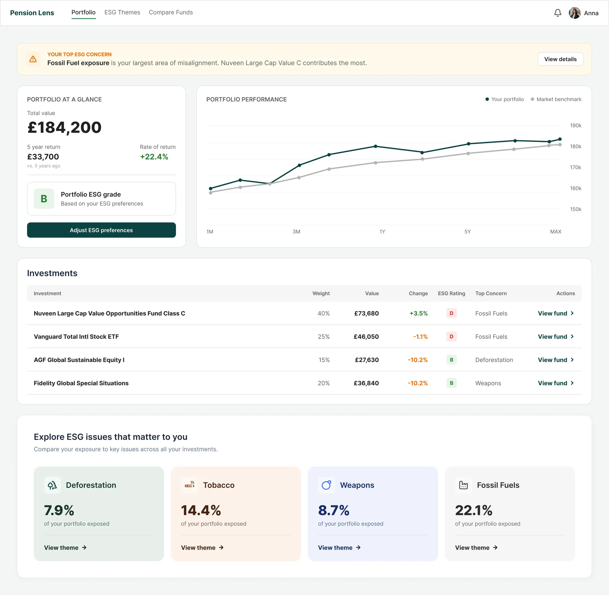
 One thing to act on, surfaced above everything else, with the fund that drives it named.
Money in familiar terms, then the ESG grade measured against your own preferences.
Weight, value and change, every row carrying its top ESG concern, not a blended score.
The theme-first way in: pick an issue you care about and compare across every holding.
Hover the markers to explore the Portfolio overview including total value, five-year performance, portfolio ESG grade, and one suggested action.
Pension holders couldn’t tell whether their money was funding something they’d object to.
Disclosure was written for analysts, jargon-heavy, score-driven, rarely designed for people. The ask was never a reskin.
Inconsistent Data
Coverage varied by issue and by fund. One headline score hid the impact underneath.
Trust Gaps
Stakeholders flagged numbers users didn’t believe. Sources and method had to be visible.
Overwhelm
People switched off from text-heavy documents long before reaching anything useful.
“I want to know if my pension is funding things I disagree with, like deforestation or war.”
Progressive
disclosure
Strip the complexity and you misrepresent the data. Keep it and nobody reads it. So depth became a layer rather than a separate page: one fund, three levels of answer, no contradiction between them.
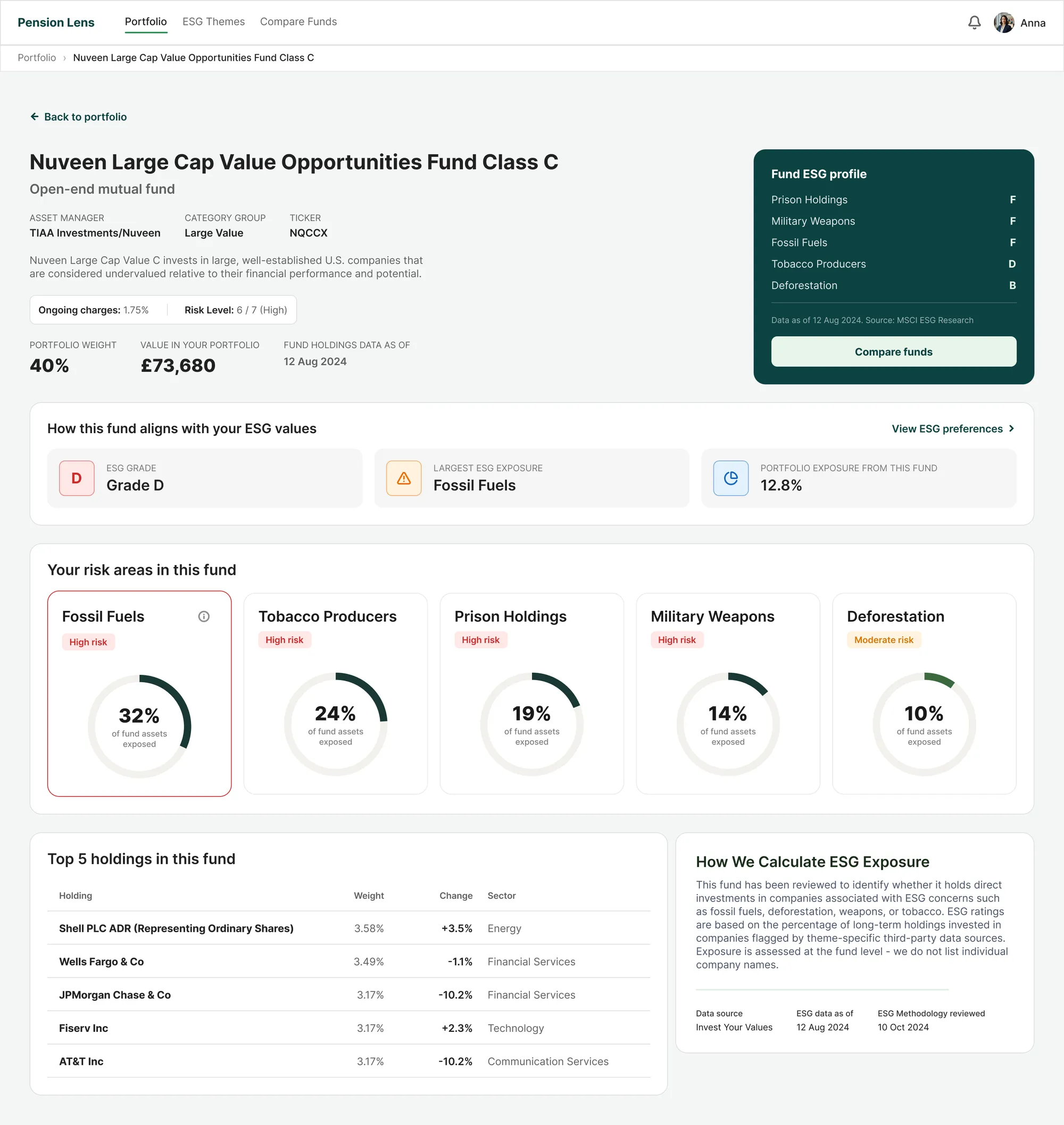
A grade to act on, the nine graded issues behind it, then the arithmetic and its sources. Nobody is asked to read more than they need.
A grade per issue on the provider’s A to F scale, each with the exposure behind it. Nothing is blended into one number.
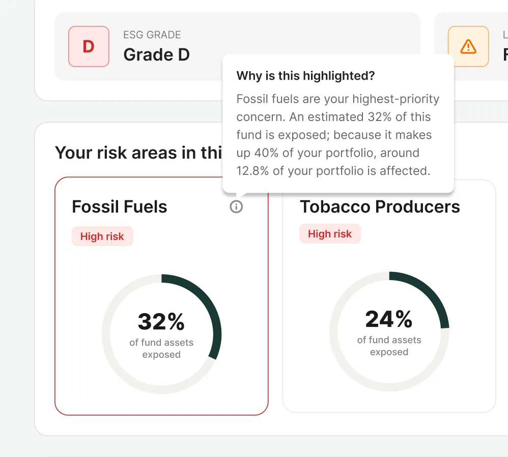
Exposure is the share of a fund’s long holdings invested in flagged companies: holding market value divided by the total of all long holdings. Fossil fuels reach 32% of this fund, and because the fund is 40% of the portfolio, roughly 12.8% of your money is affected.
The original was React — this one's a simplified HTML rebuild, just for the case study.
One fund,
taken apart
 — view full size
  — view full size
 The arithmetic is explained where the number sits, not in a footnote.
32% of the fund is exposed. It is 40% of the portfolio. So roughly 12.8% of your money is affected. One tooltip, no maths asked of the reader, and the decision is never interrupted.
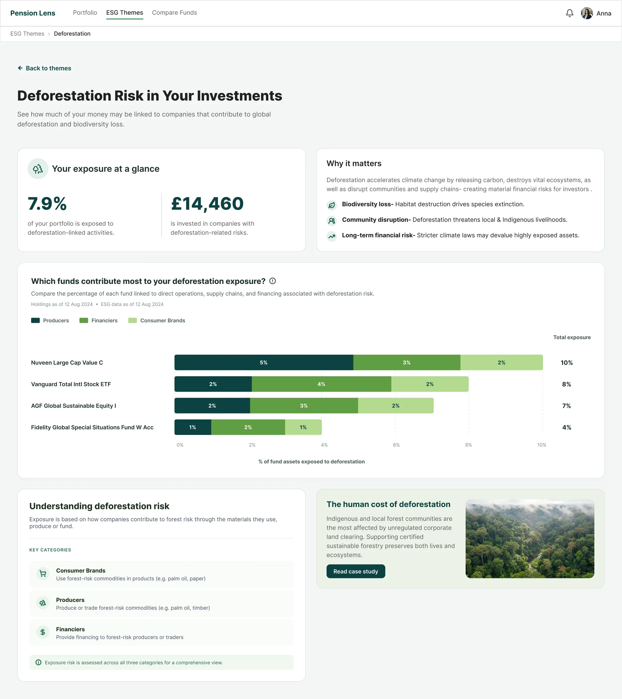
One issue, across everything you own
Every fund ranked by what it contributes to deforestation, split into producers, financiers and consumer brands, with the money named in pounds.
 — view full size
 Two ways in
Pick an issue
Nine grades, named in five words people already use.
Nine provider grades grouped into five people recognise: fossil (fuel, finance, insurance), weapons (military, civilian firearms), tobacco, deforestation, prison industrial complex, plus gender equality.
See who drives it
One issue, every fund ranked by what it contributes.
Exposure = Σ (fund weight × share of that fund flagged for the issue). Fossil fuels reads 22.1% of £184,200; Nuveen, at 40% weight, accounts for 41% of it.
Adjust preferences
Tick what matters and the portfolio grade re-reads.
Ticking issues reweights the portfolio grade, worst band first, never a mean, so a D on something you care about can’t average into a B.
Search stayed a secondary affordance. These users don’t think in tickers, they think in issues, so the issue is the index.
Figures refresh monthly with the provider feed, so every number carries its as-at date. Grades move when holdings or weights move, not silently.
Exposure is share of value in flagged companies, not a judgement of the fund manager. The copy says so wherever a grade appears.
One unified score
Simplest to build, and it recreated the exact problem the research surfaced.
Search-first
Assumed people already knew what they owned. They didn’t.
Fund-first default
Assumed a fluency users told us they lacked. Kept as the second way in.
Exposure, in plain numbers
your own preferences
Where the misalignment sits
Every issue we grade, ranked by how much of the portfolio is exposed. The largest becomes the single suggested action on the overview.
Tested with
real holders
Run with current Tumelo users alongside their research team. I facilitated sessions directly, with a Product Manager and Core Tech lead mentoring direction and feasibility.
“I liked how simple it was. I didn’t feel overwhelmed.”
“Now I understand what I am investing in.”
“Comparing funds by issues made it click.”
Nothing in the feedback asked for more data, only for it to be readable.
What I’d measure next
A prototype has no usage data, so none of this is reported. These are the four signals I would wire up on day one, and what each would actually tell me.
Unprompted explanation
Can a non-expert say what a fund is exposed to, in their own words, without being asked to look it up?
Time to a confident decision
How long one fund or one theme takes to resolve. The old answer was a PDF and an afternoon.
Overview to detail drop-off
Where people stop. Progressive disclosure only works if the next layer is worth opening.
Repeat use of theme comparison
Coming back to it is the closest thing to trust that a prototype can show you.